Good things come in Network Packages
In this project, you will explore the relationship between motion and sound, and how it can be used to convey information and meaning to engage an audience.
Project Description
Motion design plays an important role in television and online programming. Companies use advertising to announce thier products or differentiate themselves from their competitors. Similarly, network branding is used by a television and online company to differentiate itself from others and to encourage people to tune-in to their service offerings. As a motion designer, it is your responsibility to conceptualize, plan, and develop packages for networks that serve this very purpose.
For this project, you will create a Network ID and a Lower Third (see next page) for any television or online network of your choice. These 2 elements are part of what constitute a Network Package. A network package consists of a series of time-based elements created to promote a television or online network. After choosing your network logo or symbol, you will create 15-second animations for both elements—the Station ID and the Lower Third.
Strive to create a memorable visual narrative that aligns with the brand. We will look at several examples and discuss some of these concepts in detail at our next meeting. www.brandsoftheworld.com has several vector logos that can be downloaded for free.
Learning Outcomes
- Identify the standards and language of broadcast design.
- Demonstrate proficiency in keyframing and timing in AE.
- Understand the role of writing and animatics in the motion design process.
Process
- Free writing
- Storyboarding
- Look and Feel
- Animatics
- Final production
Technical Specifications
- HD 720p widescreen (1280 X 720px)
- Pixel aspect ratio: 16:9
- Frame rate: 29.97 fps
- Approx. 15 seconds each
- Full color and sound
Things to Do
- Presentation: Broadcast Design
- Watch: The making of 7TV Idents
- Read: “The Science of High Frame Rates, Or: Why The Hobbit Looks Bad At 48 FPS.”
- Presentation and class exercise: Introduction to 3D in After Effects
- Demo: Audio Editing Basics
- Quiz prep: Chapters 2,3, and 10 of Motion Graphics Design
Grading
Research and methodology (35%)
Did the designer make use of a storyboard, animatic and look and feel? How does it inform the final composition?
Design and aesthetics (55%)
Is the idea compelling and relevant to the brand name? Is there consistency in the theme? Is the audio matching the theme of the animation? Is the timing realistic? Are the keyframes interpolated?
Craftsmanship (10%)
Did the designer execute the idea to the recommended technical standards listed above?
-
What is Station ID?
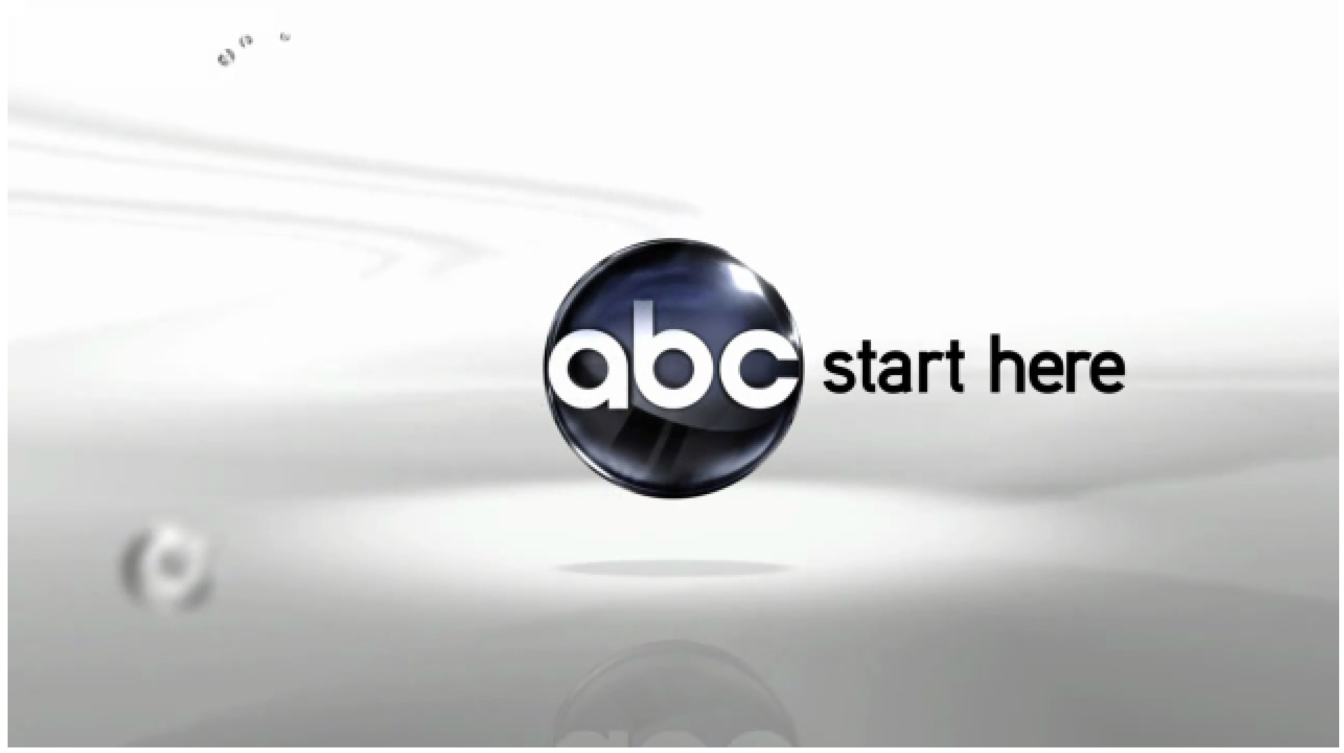
A station identification or network ID identifies the station or network being aired. It is basically seen as the application of motion to a logo or symbol to create an engaging message that promotes the brand.
-
What is Lower Third?
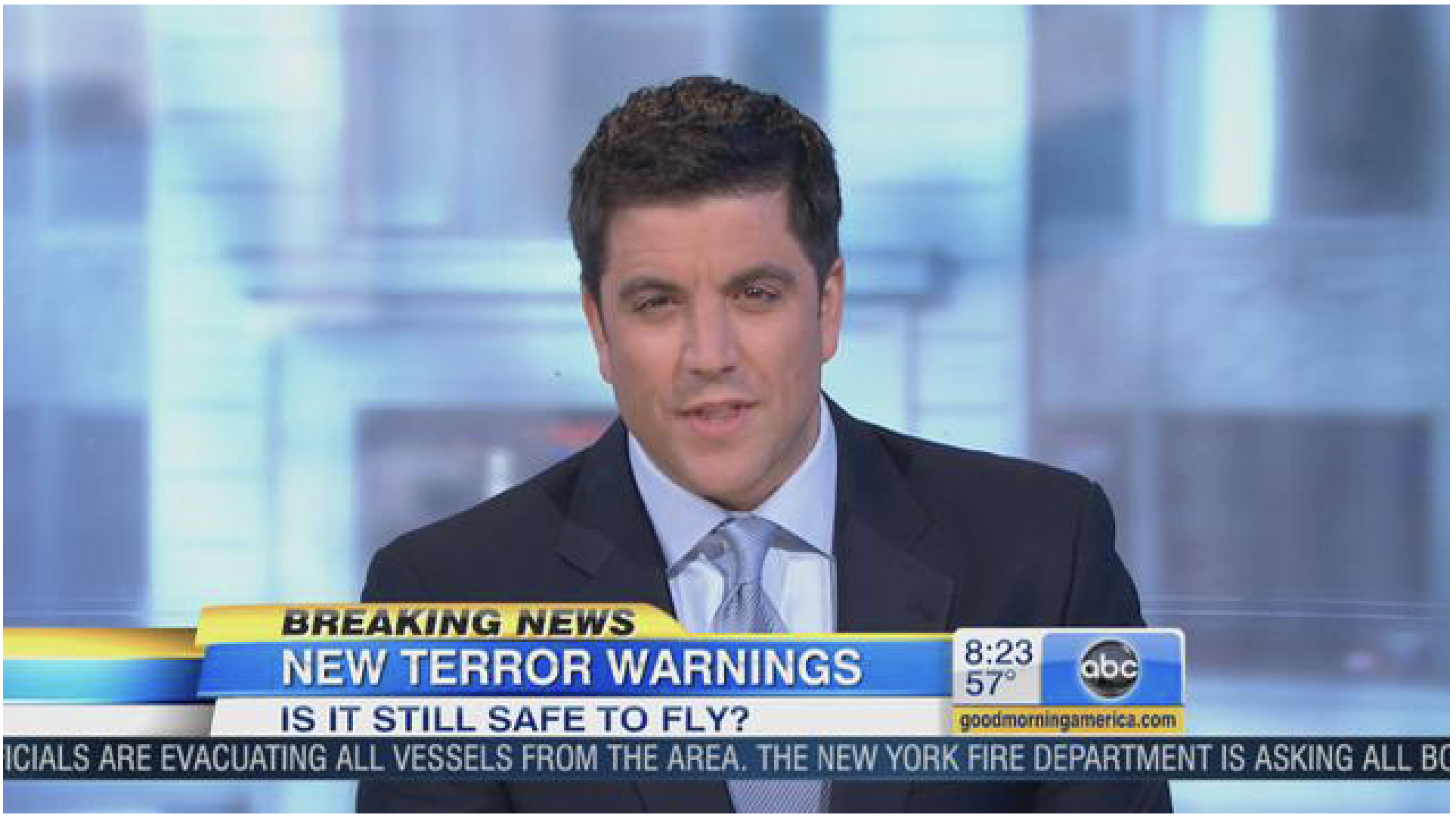
Lower thirds are combinations of graphics and text that appear on the lower part of the screen to identify the station, give information about the presenter or content being aired, or make an announcement.